
Color Matters

Photo by
Color is important. It is the characteristic that makes something lovable to you or gives you a negative guttural reaction. Espeically in clothing and home decorating. Color is emotional, scientific, natural, biological, cultural, artistic, and has historical significance. Yet, how much do you really understand it? And why does it matter so much?
The story of color starts with perception.
It’s All in Your Perception
Believe it or not, color is not tangible. It is a perceived characteristic. If you read Lois Lowry’s The Giver, then you may remember the scene in which Jonas sees the apple as red for the first time. Jonas’ perception was changed because he gained a vocabulary of color from the Giver. This perception is based on the way your brain translates light reflected on objects. Humans can only see a small range of colors because of the number of cones in our eyes for processing wavelengths. Like Jonas, you need a vocabulary to perceive color differently. Or at least understand how it works.
Color vs Hue
Colloquially speaking, color and hue are the same thing. But when thinking of color theoretically, color and hue are not synonyms. Think of hue as a characteristic of color that distinguishes one color from another. Hue describes how red looks different from green. Red, Blue, Yellow, Green, Orange, Violet [Purple], Red Orange, Yellow Orange, Yellow Green, Blue Green, Blue Violet, and Red Violet are all hue families.
The Value of Color
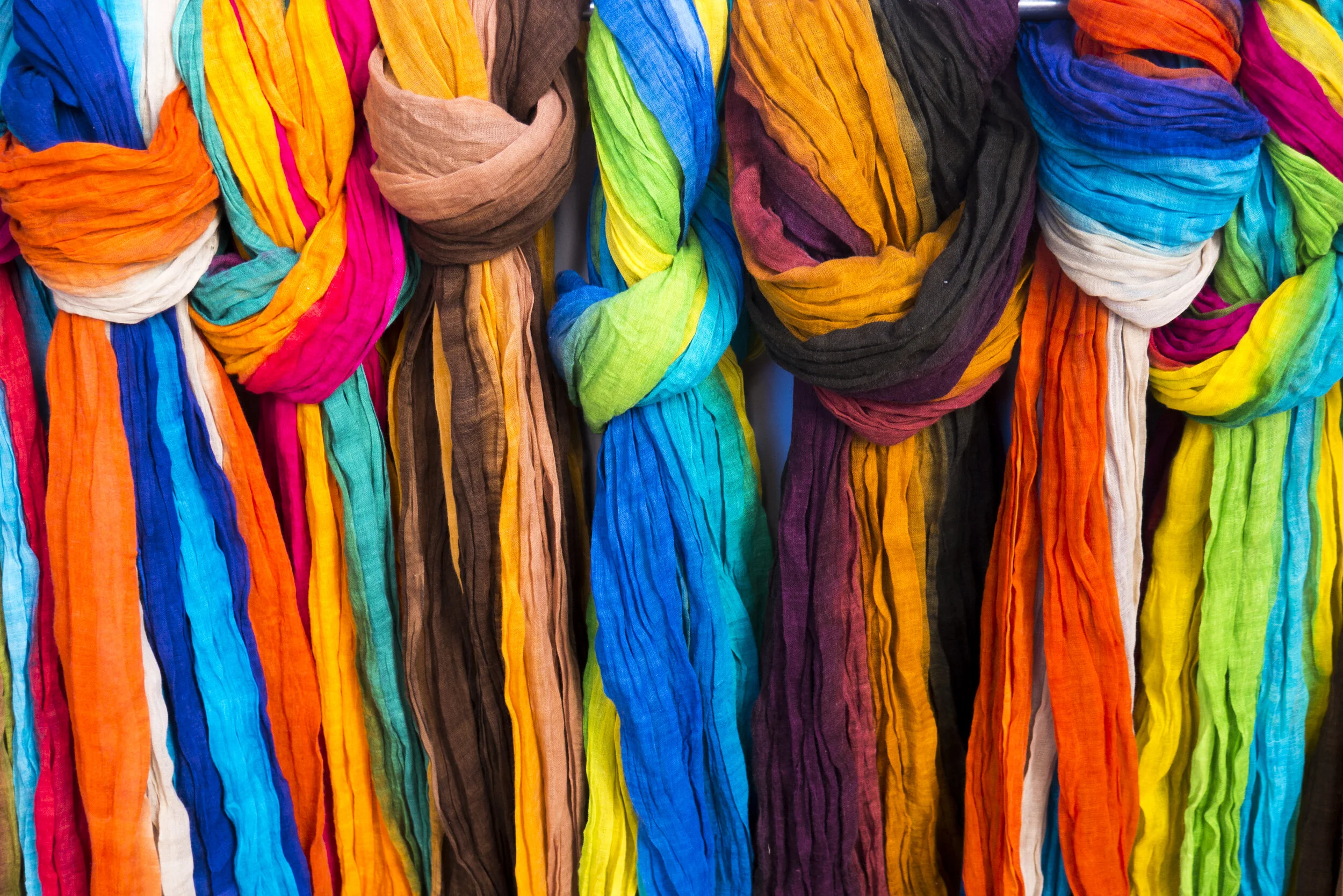
Values of red make this photo interesting
Photo by Shivam Garg
Value refers to the way lightness (or brightness if you are working on a computer) in a hue is perceived. People use words like tint and shade (no, not the kind that you throw) to discuss value. For example, pink is a lighter shade of red. And A Lighter Shade of Brown is a 90s Mexican American rap duo with some good tunes. But back to the color red; pink is a lighter shade of red while burgundy is a darker shade of red.
Get Intense
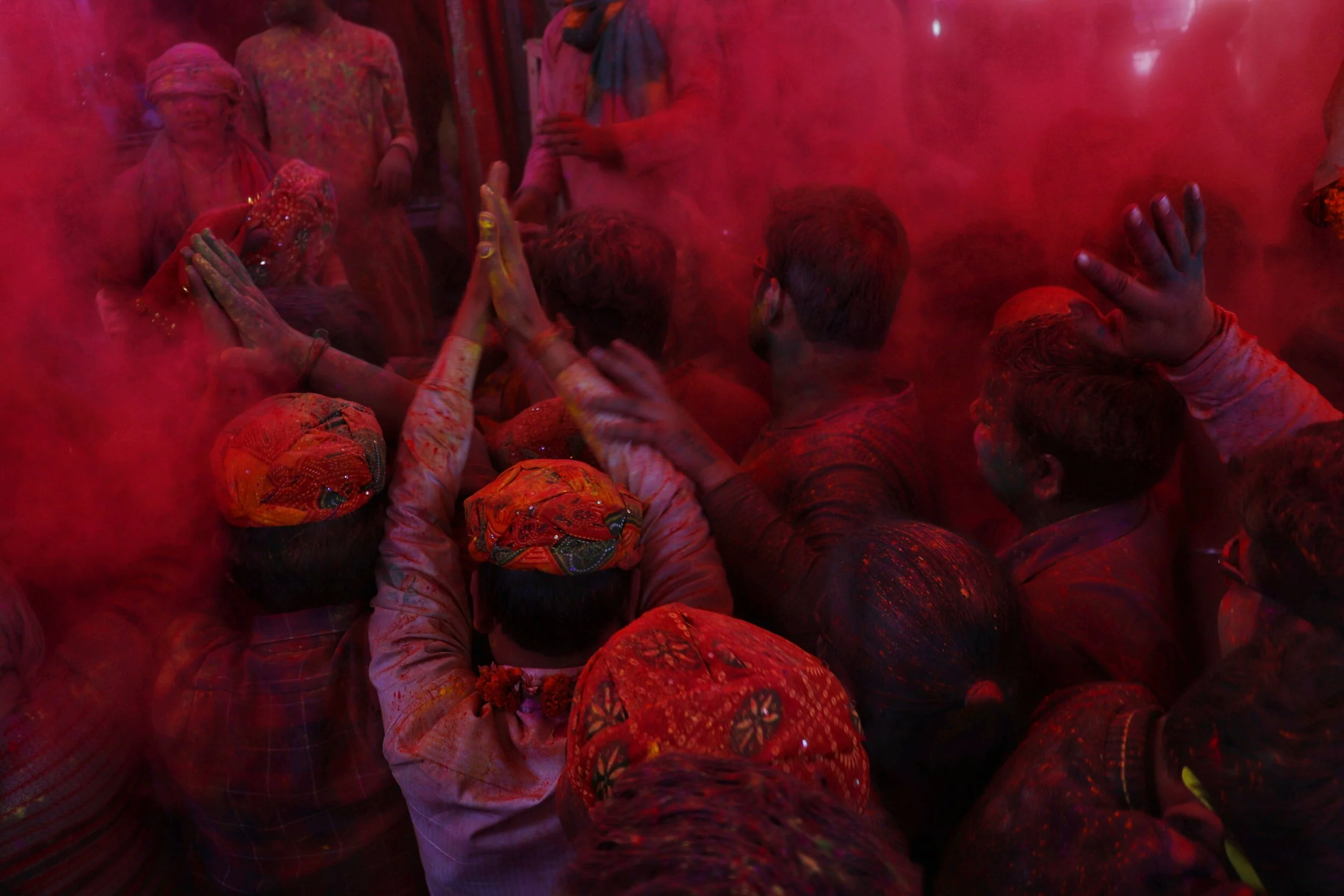
Saturated color. Photo by Matt Seymour
Color intensity is referred to as chroma or saturation. Colors that have a high saturation are usually described as bright. Think of concert posters from the 1960s or the mainstream fashion colors of the late 1980s and the early 1990s. Neon colors are saturated colors that are often used to incite intense feelings. Colors with lower saturation tend to be more comfortable on the eyes. Home and office decor are often offered in colors with lower saturation to produce feelings of calmness.
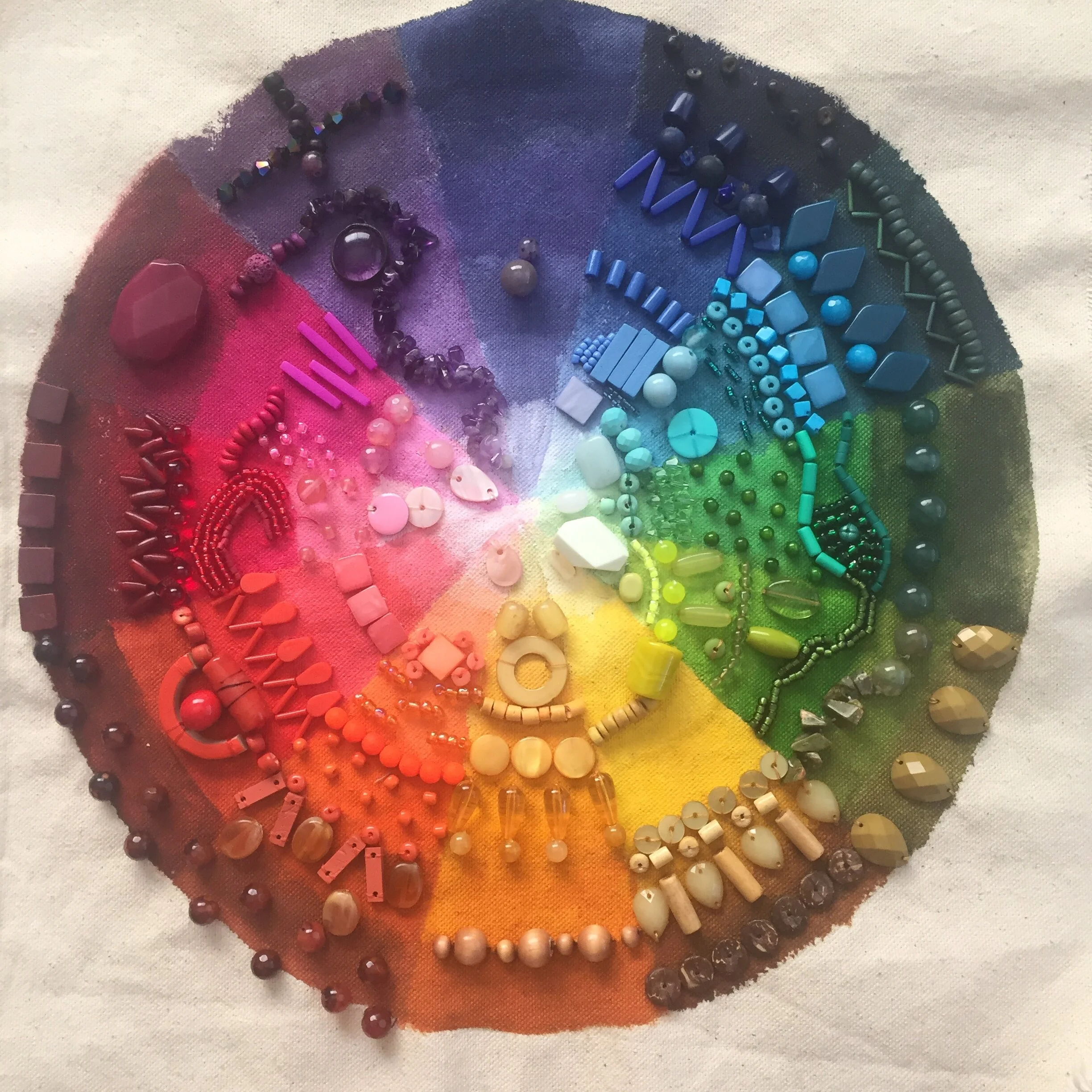
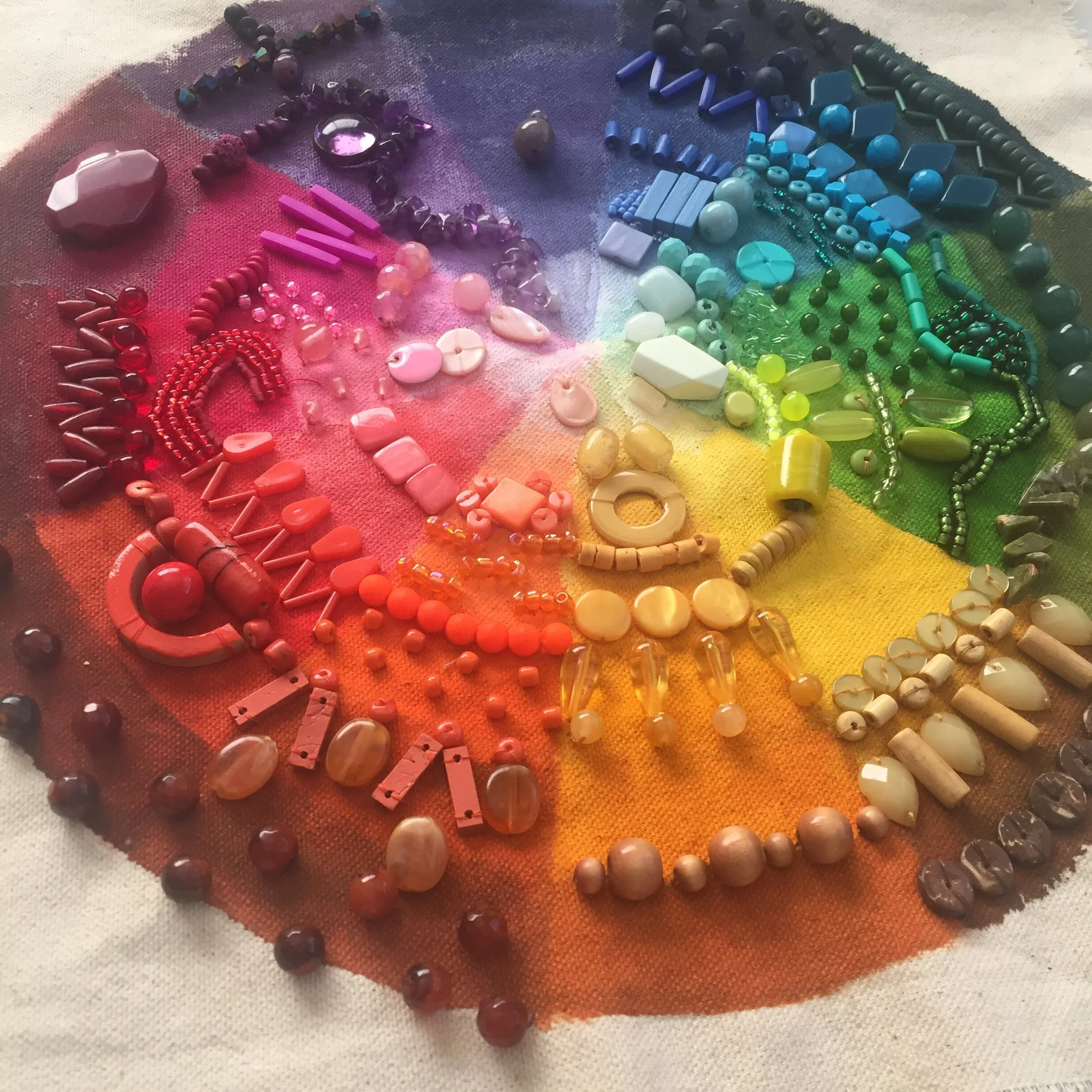
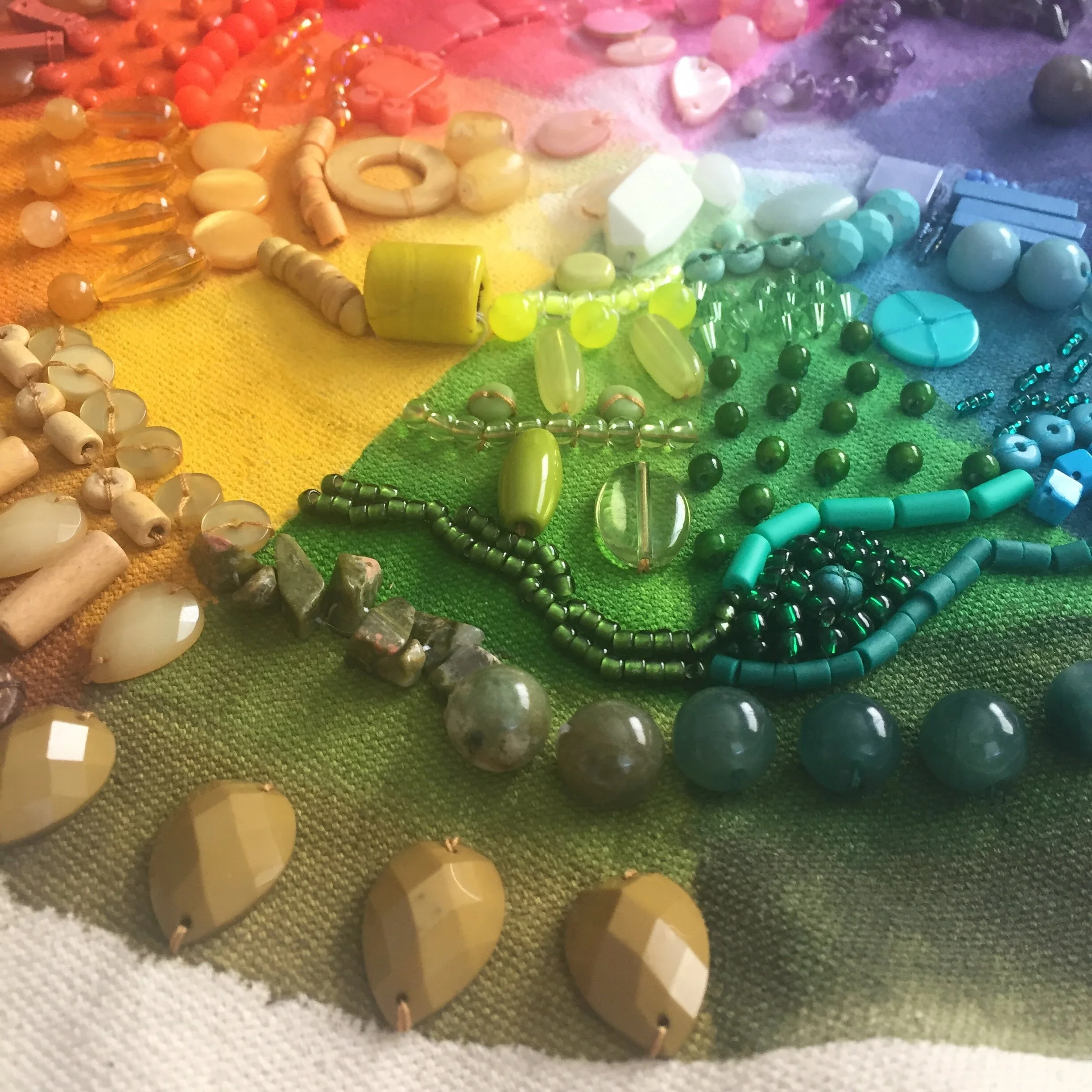
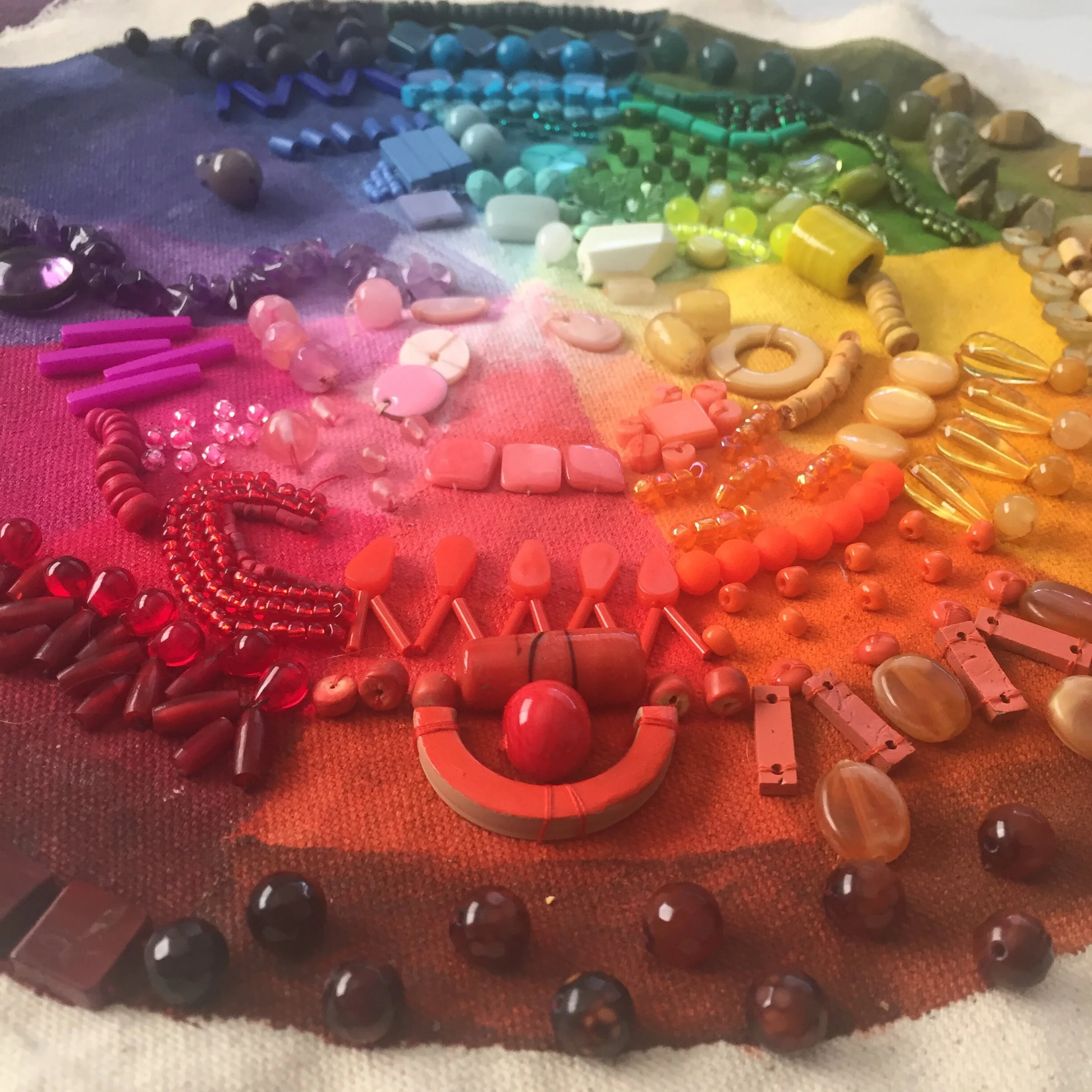
The Color Wheel
Colors arranged in a circle are known as a color wheel. Many color systems throughout modern history use the circular arrangement to easily organize color. As you can see in the following photo of the color wheel, hues are shown in a range of shades and saturation.
There is much more of a story to tell with color. Look out for future posts on this.