
The Value of a Single Color
During my years working as a designer, I realized that nothing is more contested than color. I have spent weeks of my life sitting at desks surrounded by color chips discussing colors for products. Often those colors are contested by non-creatives in those organizations due to their unfamiliarity with color theory.
Imagine a clash between creative teams and analytical teams about the use of brand colors. Imagine that the brand colors feature Apple Red which is prominent as the logo color. Leadership wants to use Apple Red for the website, email marketing, and products. The creative team uses Apple Red but also pink for links in emails and dark maroon for some web buttons. This causes outrage from the more analytical teams. They argue that creativity isn’t following a rule. Designers see Apple Red as a suggestion, not a rule because designers know that one color can have different values and chroma. Those designers understand that those prescribed colors don’t fit every intended application. Each color has a range within it that can be utilized to fit the application while still maintaining the intended brand color aesthetic.
Monochromatic
Meaning “one color,” this color scheme uses value and chroma to create interest with just one hue. Monochromatic schemes can often make a product look modern and chic. This scheme tends to be favored by luxury brands to emphasize quality rather than decoration. Visual information can easily be processed when things are in one color, which translates to an easy feeling for the viewer.
What is Chroma?
Chroma is about saturation or color purity. Saturated colors look like something from the Electric Kool-Aid Acid Test while unsaturated colors look like an old black and white photo.The designers in our example can use saturation to create a whole range of chroma.
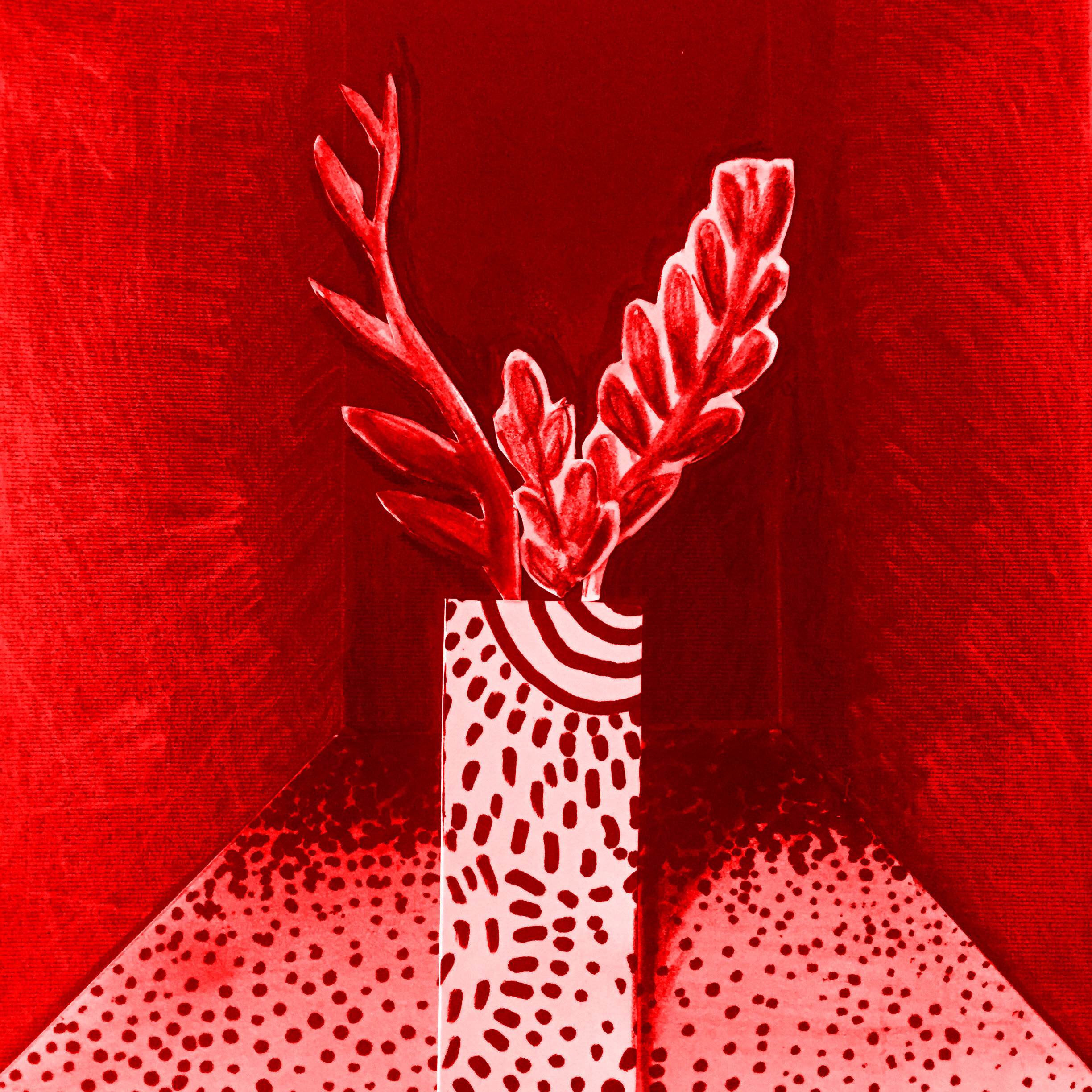
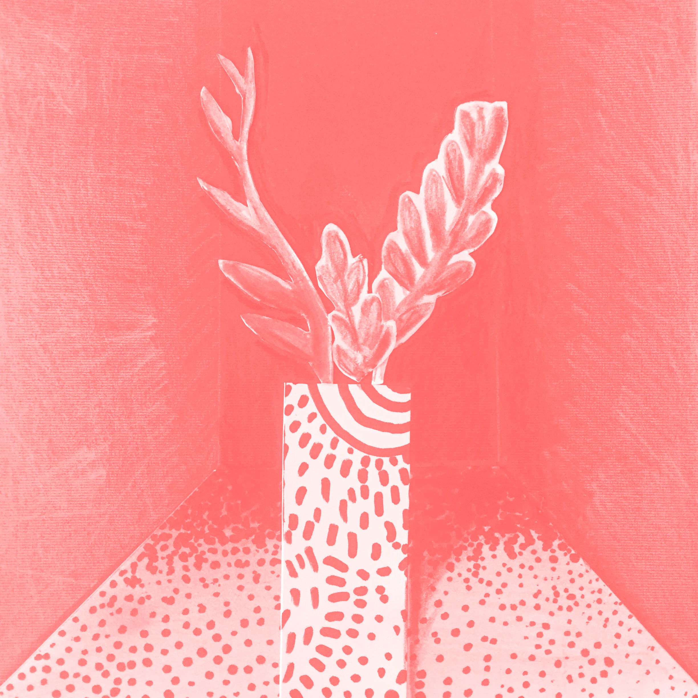
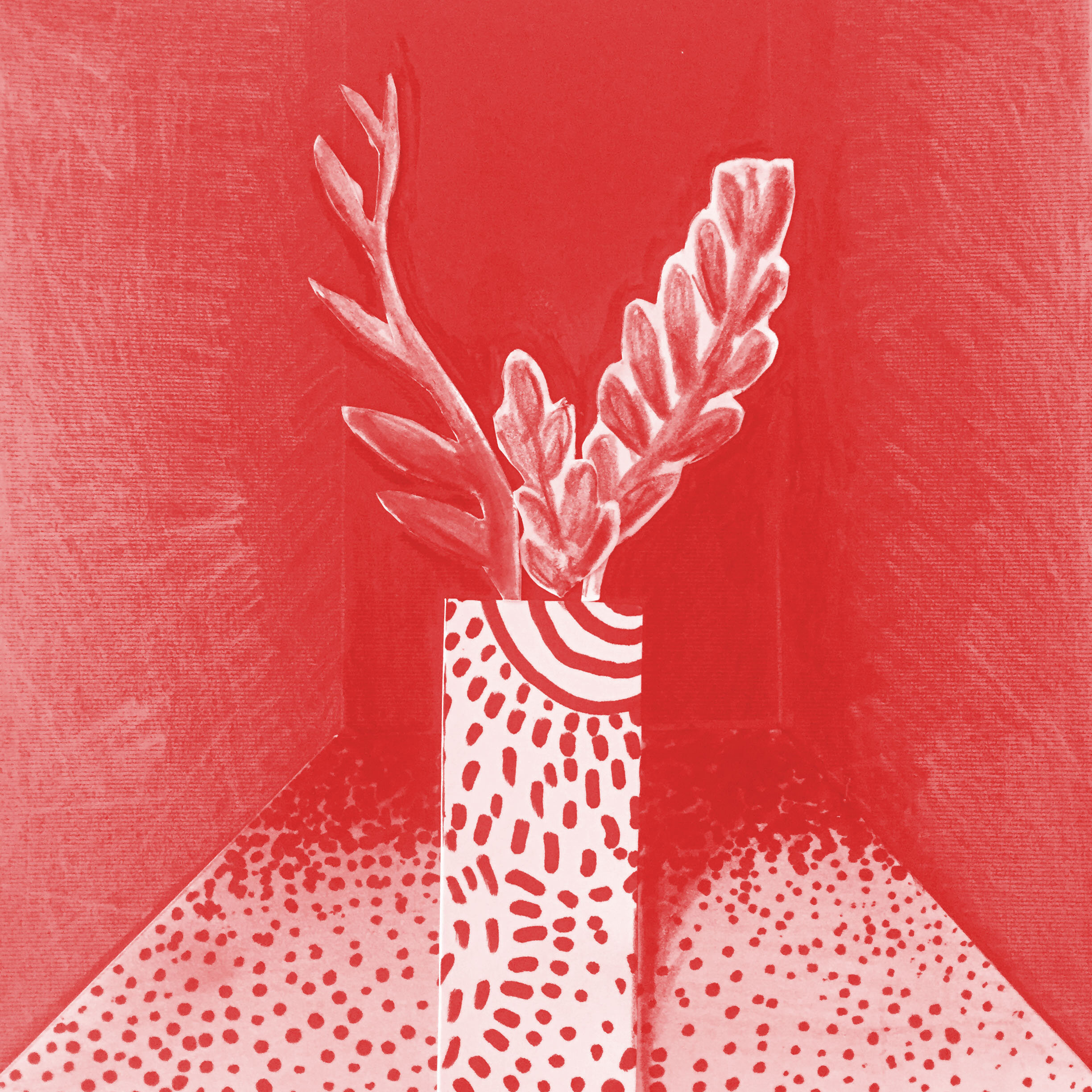
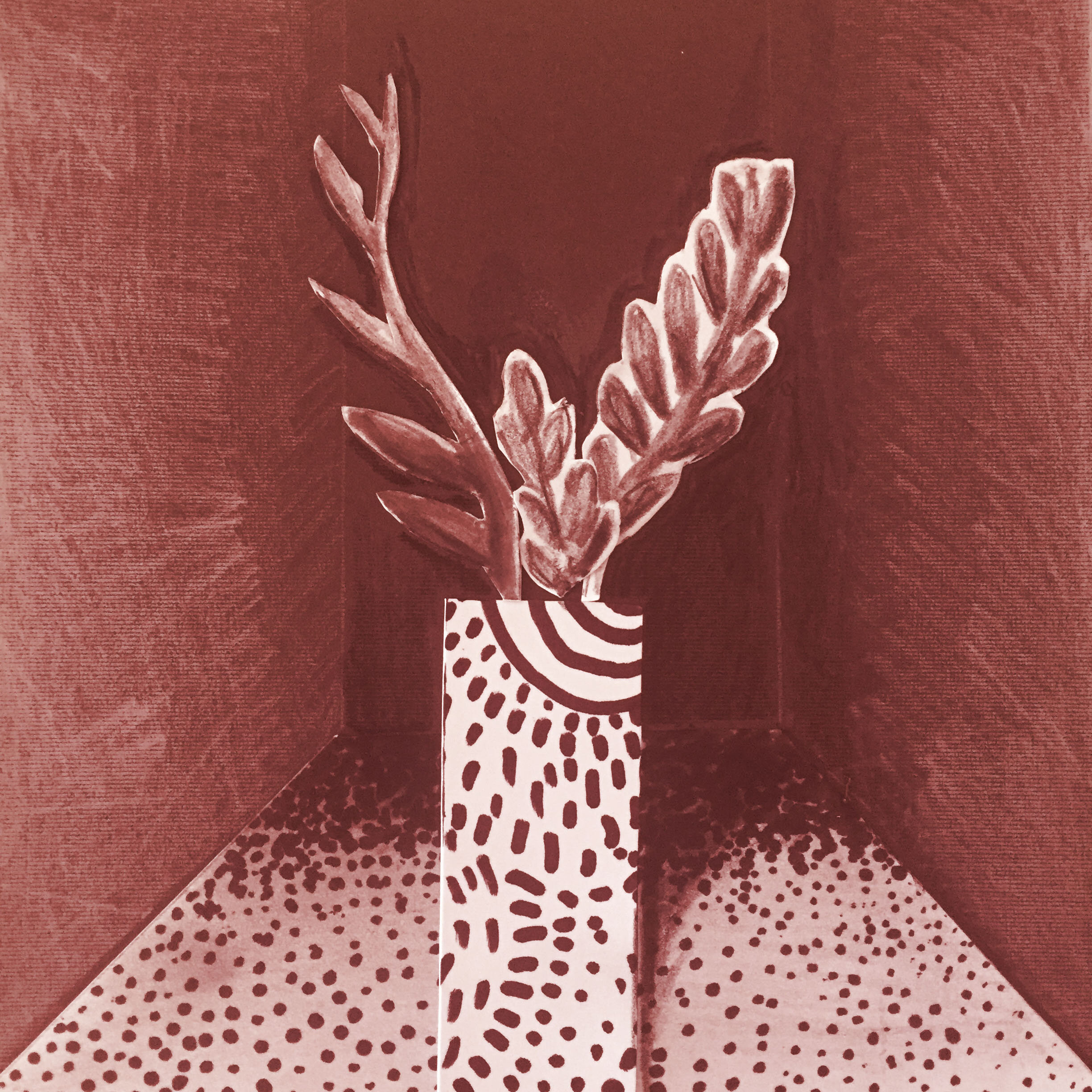
What is Value?

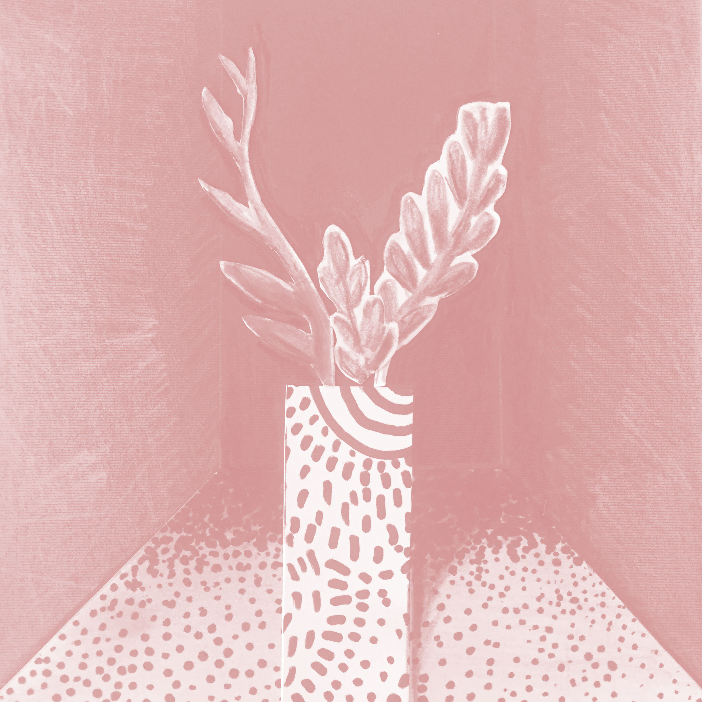
A monochromatic collage showing values. Lighter values are in the foreground and darker values are in the background to show visual depth.
Value is lightness and darkness in colors. This can be best illustrated by a black and white photo. Photographs are created using light reflected onto a piece of paper or object. Those reflections appear as shades of grey and black. The brightest light is shown as white. Value can emphasize or de-emphasize a design element.
How to Use Value and Chroma
Value and chroma can be used in your projects for home and your business to create colors that tell a story that you want to tell. Dark values are often used to illustrate mystery, seriousness, and depth. Light values are often used to illustrate softness or happiness. Mid-range values tend to illustrate normalcy and comfort. Light values X low chroma or saturation produces soft dusty colors that work well for website designs. Midrange values X mid-chroma makes for colors that are perfect for all sorts of products. Dark values X low chroma colors are almost neutrals. Those chromatic neutrals are great as copy on websites, especially on a tonal background of the same color.
Knowing this information, the designers in our example can view Apple Red as a suggestion, not a rule. They can solve design problems better because they know how to apply their knowledge. However, those designers need the support of others in their organization. During my Design Thinking for Professionals workshops, solopreneurs and teams learn the basics of color to work cooperatively in a design thinking organization.